


The New Normal is a visualization that uses Google Search data to understand how the pandemic might have affected people's shopping behavior.


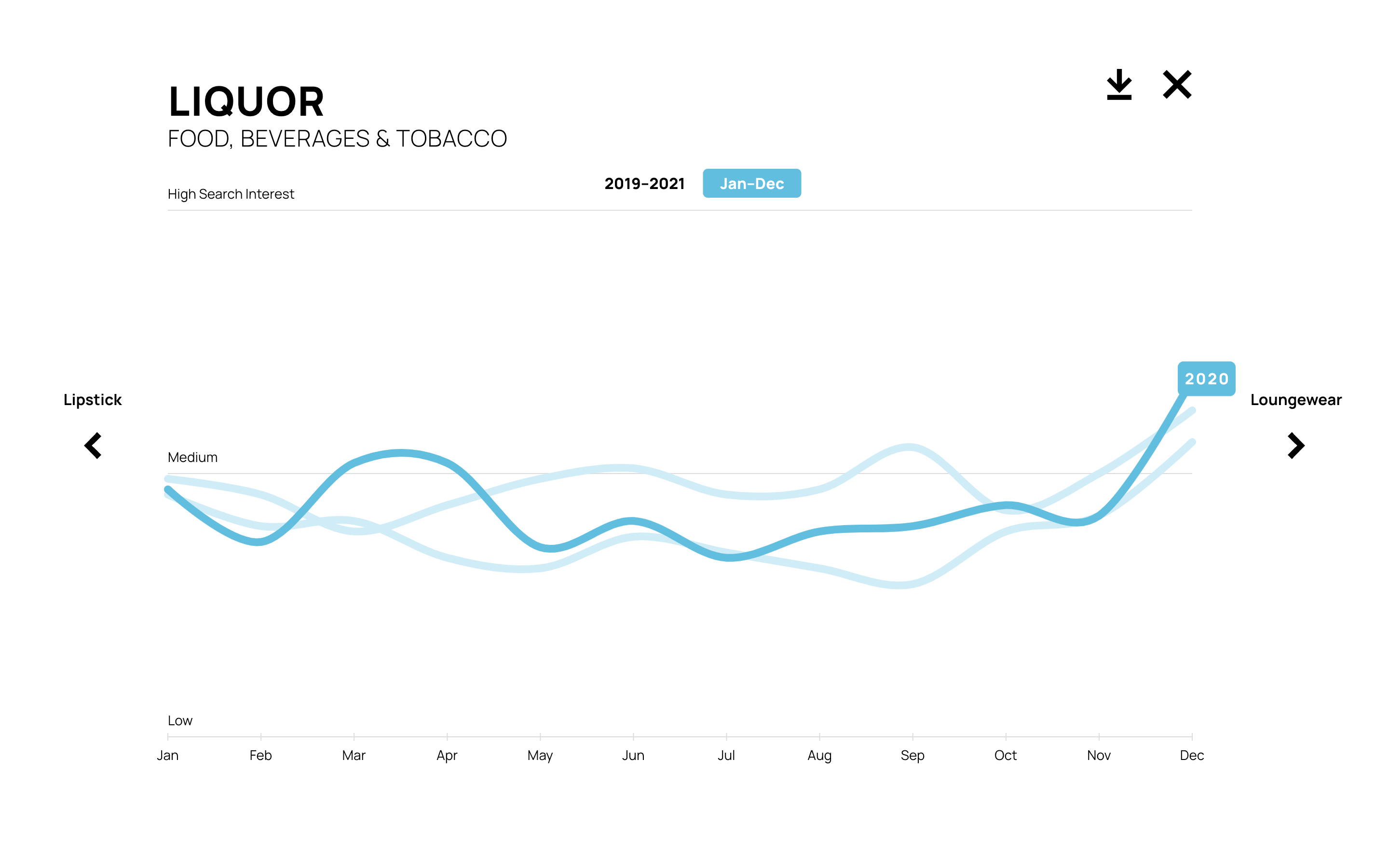


The COVID-19 pandemic forever altered people’s lifestyles, habits, and created a stark divide between the "before" and "after." Intrigued by this shift, we wondered if there is a way to capture this divide by looking at search interest for everyday products before and after the pandemic began using Google Search data. To test our hunch that searches for pandemic essentials would surge, we initially investigated everyday products that became especially in-demand once the pandemic hit hard, for instance, toilet paper, freezers, and sanitizers. The dramatic spikes in search interest for these products convinced us to delve deeper into this idea and explore the pre-versus post-pandemic divide across a wider range of commonly purchased goods.
To capture a representative "basket of goods" rather than simply listing random products, we turned to Google Product Taxonomy. This system categorizes all products—think "Sports Goods"—and the specific items that fall under each category. Everything listed on Google Shopping relies on this taxonomy, which made it a perfect way to identify familiar common products. Because the taxonomy is structured like a nested tree, the lower levels actually provide very specific terms we could use as search queries, like "soccer balls." After cleaning and prepping the data, we ended up with close to 300 products that exhibited significant changes in search trends around the time the pandemic began.
Next, leveraging shape trend analysis algorithms, we categorized the terms into three distinct categories: “Normal” (trends that remained unaffected by the pandemic), “Unusual” (trends that spiked or showed unusual behavior), and “New Normal” (unusual trends that persisted into 2021). This categorization method offered us an interesting conceptual framing as well as ideas for simple ways to present the information that would encourage exploration.
This project was a great example of how even a simple question about human behavior is really difficult to answer. As we looked at the data, we were surprised at just how complicated it was to answer a simple question: "How did the pandemic affect what we buy?" Since search patterns are seasonal and influenced by many factors, driven by dynamics unrelated to the pandemic, it became surprisingly difficult to isolate a single cause. In addition, while the search data is known as an interesting proxy for our collective interest in a particular subject, it is also really hard to extract the exact intent behind the search query.
After the project was published, The New Normal ended up generating the most user engagement out of all the previous projects we've worked on with Google. From the design perspective, what made this project so successful is its simplicity. As with most things when it comes to effective communication—less is more. We were able to convey abstract information in a simple and direct way by using a minimal design approach—a grid of sparklines categorized into three shape patterns we can all relate to. This approach, which balances editorial narrative with the ability to explore on your own, ended up being effective in drawing people in and encouraging them to explore and learn something new.

